Nishma KVOct. 31, 2025
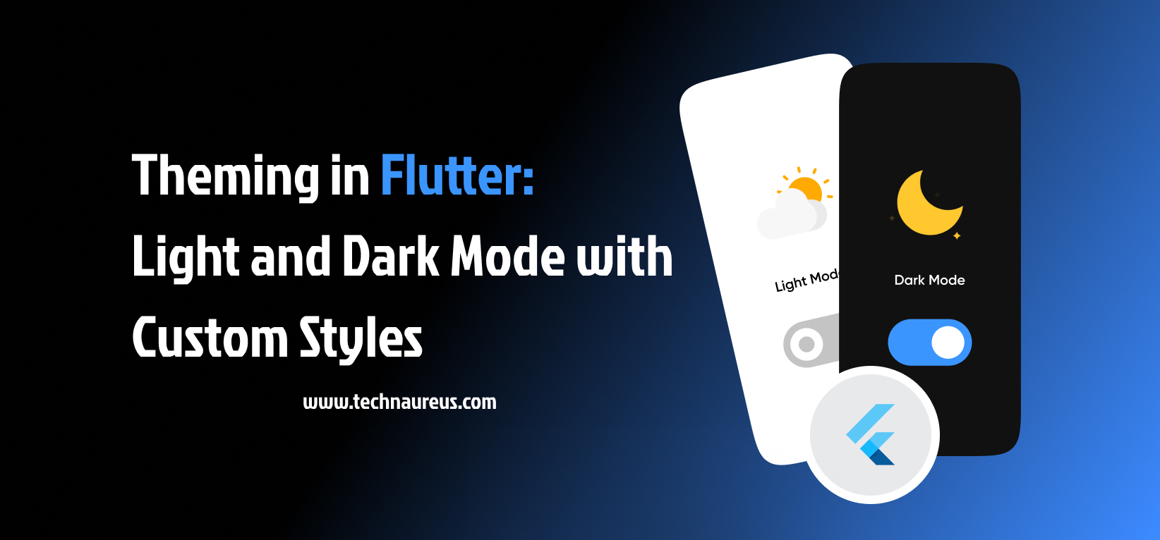
Have you ever opened an app at night only to be blinded by a bright white screen? That’s where light and dark modes come in — not just as visual enhancements, but as essential usability features. Fortunately, Flutter makes it easy to implement both light and dark modes, while also allowing for extensive customization to match your brand's identity.
Theming in Flutter refers to defining the overall visual style of your app, including colors, fonts, icon styles, and more. Flutter allows you to configure these design elements in a centralized way using ThemeData, which ensures consistency across all screens and components.
This centralized approach makes it simple to update your app’s appearance. For example, changing the primary color from blue to green only requires one modification — Flutter handles the rest.
Flutter comes with built-in support for light and dark themes. You can define separate themes for each mode and let the system decide which one to use based on user preferences. Flutter supports three theme modes:
By using ThemeMode.system, your app can seamlessly switch modes when the device settings change — no additional logic required.
While the default themes work well, true app personalization comes from customizing your visual style. Flutter enables you to tailor the UI to reflect your unique brand or design language by allowing:
These customizations ensure your app stands out while still respecting light and dark preferences.
Supporting both modes enhances user comfort and modernizes your app experience.
Flutter’s theming capabilities provide several advantages:
These features minimize development effort while maximizing consistency and professionalism.
Some users prefer to manually select their preferred theme. Flutter allows developers to provide this functionality through a settings screen that includes a toggle for light/dark mode.
To implement this:
This feature enhances accessibility and user satisfaction by offering personalized control.
Here are key recommendations to get theming right:
By following these practices, your app will look polished, modern, and consistent.
In today’s app ecosystem, theming isn’t just about visual appeal — it’s about enhancing usability, accessibility, and user comfort. With Flutter’s powerful and flexible theming system, supporting both light and dark modes is straightforward. By defining centralized styles, customizing components, and giving users control over their theme preferences, you can deliver an app experience that feels intuitive, stylish, and future-ready.
Take the time to test your themes thoroughly, personalize your app’s appearance, and follow best practices — your users will thank you for it.
You can enable dark mode by setting the themeMode in your MaterialApp widget to ThemeMode.dark. To follow the system setting, use ThemeMode.system.
Yes. You can define custom fonts using TextTheme and custom colors using ColorScheme or directly in ThemeData.
Create a toggle (e.g., Switch) in your app settings and store the user’s preference using a local storage solution like shared_preferences.
Yes. You can override the app-wide theme by wrapping a widget (e.g., a screen) in a Theme widget with a different ThemeData.
Yes, you can use AnimatedTheme to smoothly transition between themes.


0